
Monoprinting
Monoprinting is a process where the print can only be produced once. We used different materials are placed between surace and a piece of acytate with ink on it. The different materials acted as masks. we also did things like drawing on the base surface.
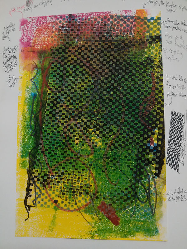
This was my first monoprint. I thought we were supposed to continue adding layers instead of making multiple, so this one took much more time and has more layers than the other monoprints.
I like how the compsition is really busy(in most cases i like lookin at busy compositions).
There is also a lot of blending in the colors since i did not wait for the layers to dry before printing the next layer on.
This print did not have a particular goal or subject in mind and was just me experimenting and trying out the different masks avalible and the effects on the work.
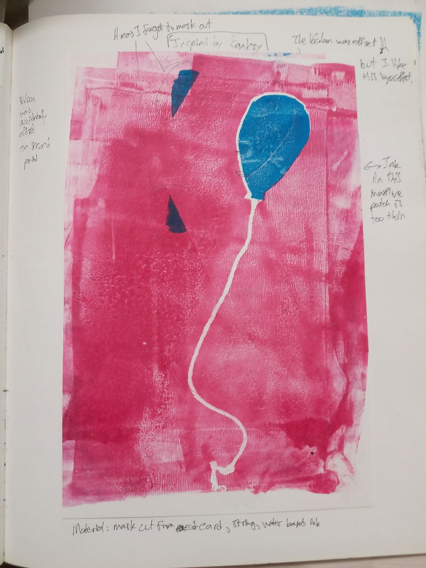
This is my second best monoprint. I realised that we could use stencils as a part of monoprinting.
For this one, i cut out a baloon shape from some paper and then laid out some rope as the string on the acytate piece.
However, after this, i wanted to make it look better, so i decided to do the reverse, printing in the small hole where the baloon is. However, for some reason i did not properly center my page when cutting the baloon.
Because of this, i had to put pieces of paper, hoping that ic blocked out all of the blue. (obviously not because of the two triangles)
This piece was HEAVILY inspired by baksy's baloon spray paint.
Other than the two triangles, i think an important factor bringing down the quality of the piece is the uneven and messy roller marks when i put the ink down.
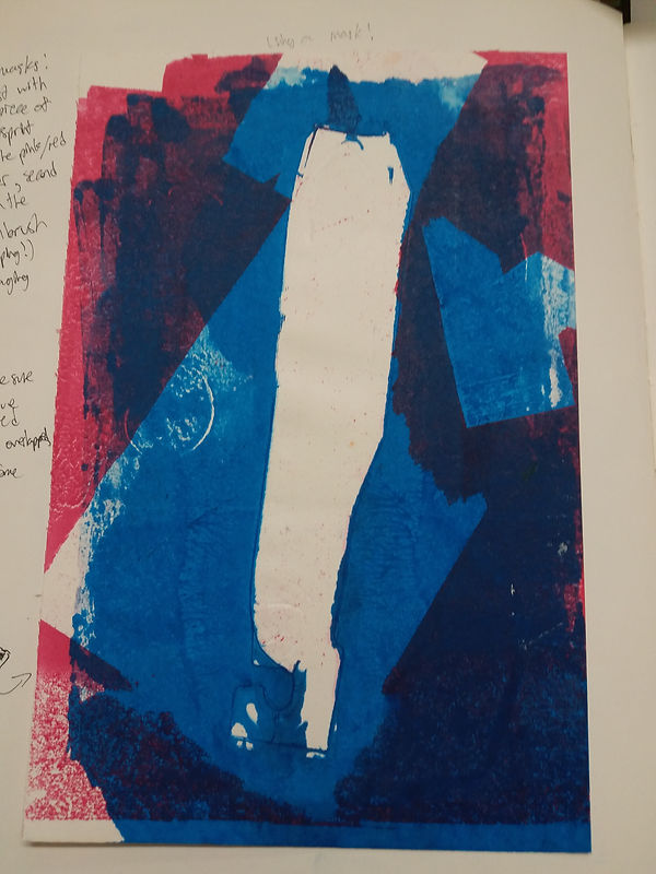
This is my third best piece. (the others were done really quickly because i needed evidence of experimenting with different techniques (chalk on the base page, etc)
This piece was to prove i knew how to mask.
For the base red/pink print, i took various scrap newsprint pieces i had at the bottom of my bag and put them on the page. This gave me loads of cool, random looking masked out regions.
Then, on top of that, i added a blue layer. For this blue layer, i used a piece of packaging for a pen i bought a few days ago. It has a cool look, ressembling a toothbrush packaging (outline). The middle stenciled area has the highest contrast (dark blue and white) and so brings the viewer's attention onto itself. I like the basic geometric aesthetic.
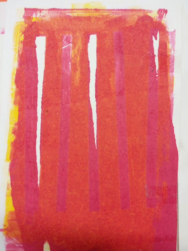
For this print, i had planned to have an orange background, and lines varying with red and yellow colors. However, i failed, as the red got everywhere. (over inked)
Due to this, i had to scrap the idea and leave it as it is now (as printing yellow on top would just make it orange instead of the pure yellow i wanted.
I want to say that if i did it again now it would be fine, but i still dont know how to do monoprinting well.
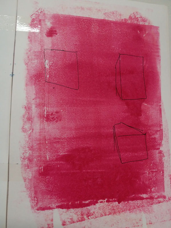
For this print, i just wanted to see what pen (ink - fine liner) would look like under a basic monchrome print (pink).
The acytate was not inked properly and evenly. however, i could still see the effect (not much affect on black pen since it is so dark)
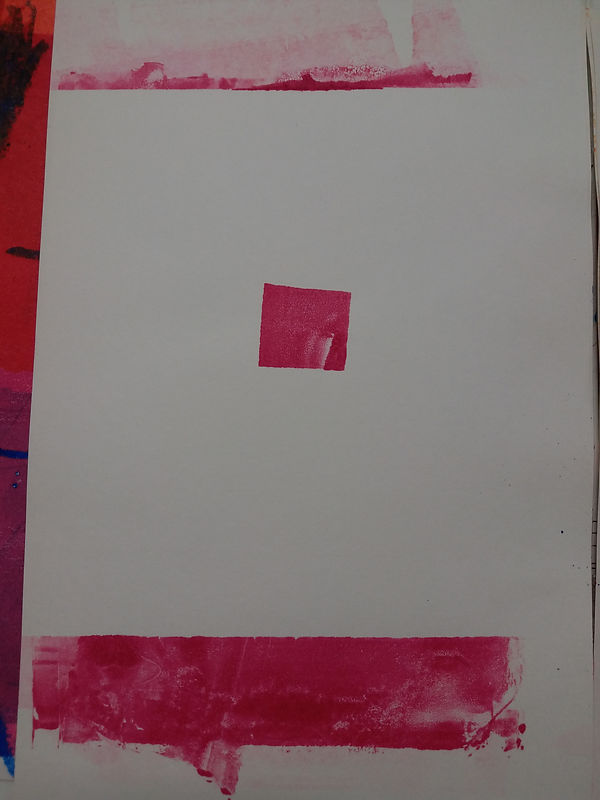
For this print, i was once again experimenting with masks. I wanted to make a print of a small square of in. However, i then deicded aftrer to ink over the edges of the entire sheet as it would make it more interesting than a single cube.
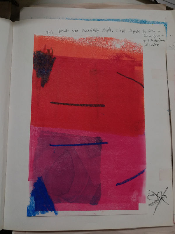
For this print, i wanted more experiments with drawing under the print. This time, i used a piece of dark blue chalk to make the markings, and then printed on top in pink, and then a small print in yellow.
The pink wasnt dry yet, so it merged into an orangy color.
This print shows my growth inking monoprints. For this one, it is much more even and looks better.
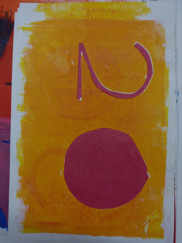
This is another print that has much better inking than the others. It is a orangey yellow background (printed once with the 20 masked out) and then a piece of paper that printed the opposite (masked everything out except the 20) and then printed in red.
This is the first time i had a successful print using the masking and printing twice technique.
I also used this as a test to see if i could use this 20 design on my final (olympics japan 2020)
It looks better than i thought, but it does not fit my idea of what the final should look like and so i didnt use this.
Overall, i think that this unit was incredibly useful, as it taught us methods to use printmaking that could be done quickly (no need to carve or scratch), and so if im running low on time i can use monoprinting to stencil or print other elements without carving lino pieces or scratching etching plates..