
Mateuz Urbanowicz
When I looked for designs for storefronts, I found an artist called Mateuz Urbanowicz that drew and painted storefronts in Tokyo.(they don’t only paint Tokyo storefronts, but this is what I will be focusing on in this artist research)
Mateuz Urbanowicz is an artist that was born and raised in Poland. He studied electrical engineering, and practiced art as a hobby. While creating his art, he worked with WACOM, and began to see art as a potential source of work.
He studied art the Polish Japanese Institution of Information Technology. Through a scholarship from the Japanese government, he moved to Kobe and had the opportunity to study animation and games. After graduating from the design university in Kobe, he worked full time as a background artist at Comix Wave Films in Tokyo.
In 2017, he became a freelance artist and began work on his personal projects, including the Watercolor Illustration book “Tokyo Storefronts”
His book “Tokyo storefronts” played a large part in inspiring the design for my final Tokyo 2020 Olympics printmaking project.
The book includes many storefront illustrations, colored in watercolor. Mainly, I got ideas from some of the elements from the individual illustrations (e.g some rack designs, storefront doors etc)
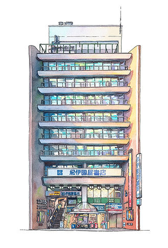
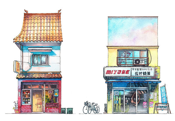
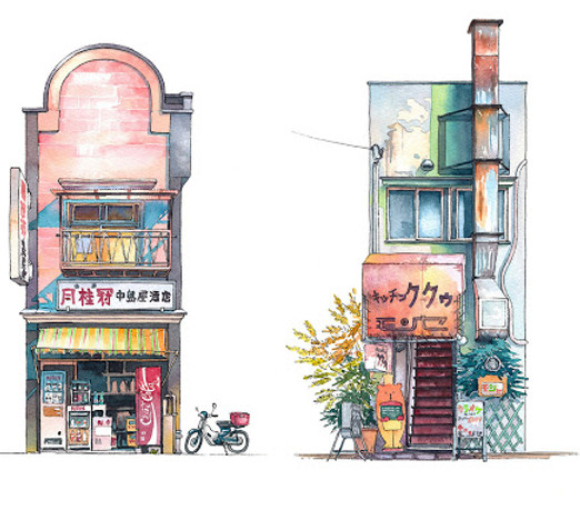
Examples of work

.jpg)

Content
His storefront design work is two dimensional, and uses a mix of stylised elements and realistic elements. The line work leans towards a more realistic style(but still simplified to an extent, and the colors are based in reality, but is simplified and is not rendered to a great extent. (they look like stylised studies of either real or photographed storefronts)
Form
This piece of work looks like a simplified version of a photograph-accurate storefront art piece.The main elements in his work are color and linework. The works also feature a good amount of texture, giving the audience an idea on how old or how new the store is. (e.g: moss growing on some bricks, or some uncleaned areas, etc). There is also one piece of work in the book that uses perspective as a large aspect of the work (the interior of a bookstore, drawing in perspective).
The color schemes for each of the stores changes. (some complementary, some analogous, etc). This could be because the storefronts are derived from real storefronts)
The storefronts are also sometimes simple and sometimes busy, some with numerous elements laid out in front of the store like flowers and racks, some with plain glass fronts, with simple layouts.
My Opinion
I think their work is really cool, and the main thing i am inspired by is the use of color, linework and texture. I especially like when the storefronts are full of racks with items. It feels more personal, more like a neighborhood shop that looks really good.
Comparison
From what i remember when i read another one of his works titled “Tokyo at night”. That book is more so focused on scenery, composition, rendering and other more technical aspects. The works in the book felt like polished watercolor paintings. Whereas the book “Tokyo storefronts” feels more like a design book, with numerous examples of nice designs as well as a professional artist’s opinion on the design at hand.
Transcript

