
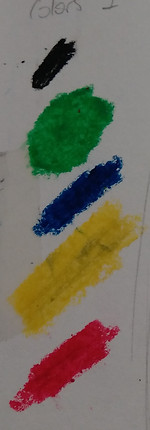
Inital sketches and rough designs
These are the initial sketches we were told to make. From these designs, four would be developed and a single one would be made as a final piece.
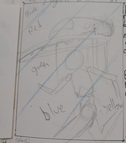
Design 1:
I hoped to include elements of japan's technological advancement in this design.
I chose the bullet train, an iconic symbol of japan's technological growth.
In order to tie it into the theme of Olympics, i decided to add a figure running. This was also supposed to show mankind racing against technology.
The blue lines are where the color blocks are seperated. all elements such as the train and figure would be inverted to the next color over.
This provides a lot of options while keeping to a limited color pallette, allowing for quick prints and easier choices when it comes to color.
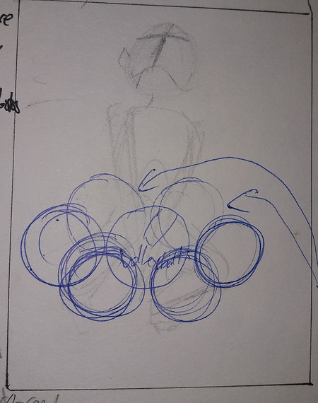
Design 2:
Volleyball pose figure. The volleyball was supposed to replace one of the rings.
Overall the pose is quite plain and overall the idea itself isn't too interesting. However, i think the pose for the sofe lino (one of the later designs) would fit in better as it is more dramatic.
That pose would work well with a Gian Galang style monoprint (lines running through, dots and lines suggesting movement)
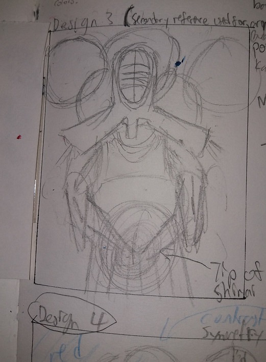
Design 3:
I wanted to make a design utilizing kendo, as i though the sport was quite interesting.
However, I didnt really like the pose too much so i changed it slightly in 3.5
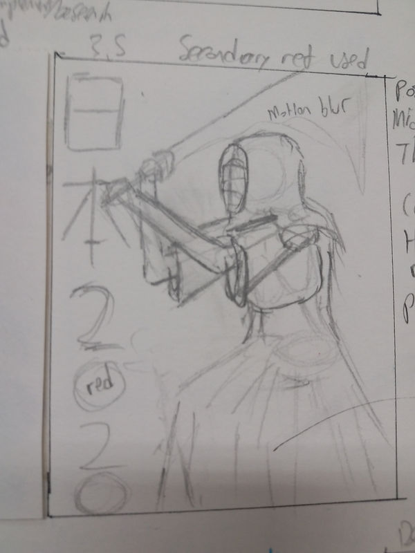
Design 3.5:
i like this design much more, especially the text going down instead of across. However, i determined that at my current level of printmaking quality and speed, i would encounter many problems when trying to print the uniform as a believable fabric

Design 4:
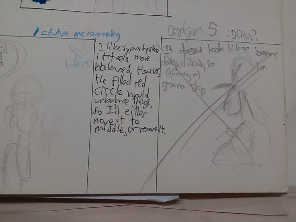
I like the symettry, as it makes it feel more balanced.
I made it horizontal because i thought having more of a variety would improve the amount of ideas i could come up with.

Design 5(6):
Swimming, i wanted balance again.
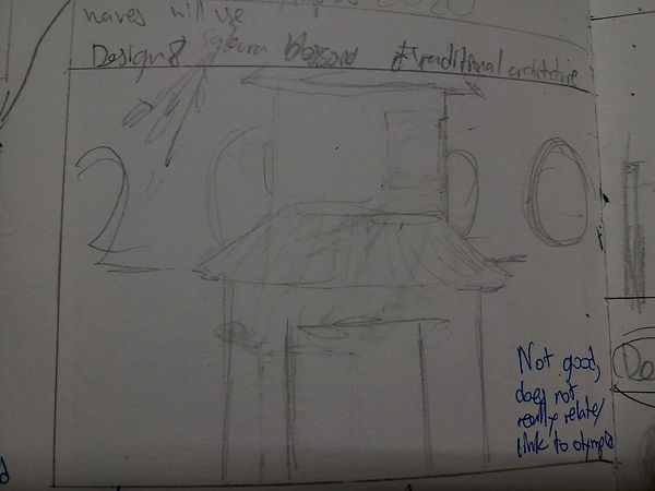
Design 6(8):
I just wanted one of my rough/initial designs to be of japanese buildings, so i made one super quick, super rough
Design 7(6):
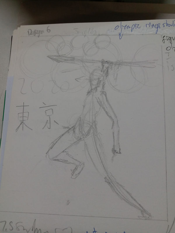
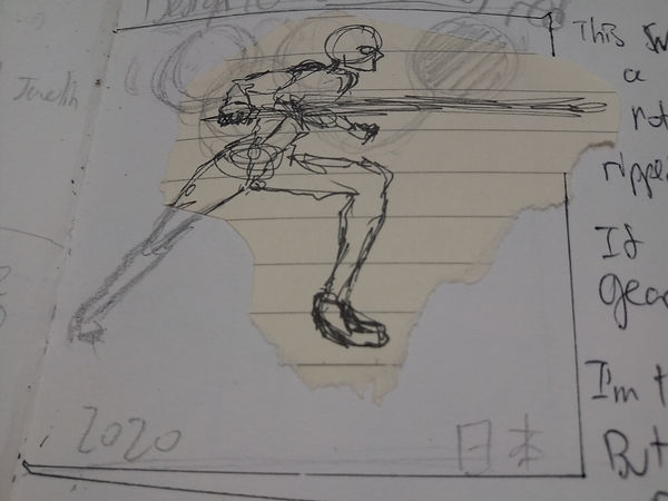
I rememer seeing a cool pose where someone was throwing a javelin, so i tried to re-create it from memory (since i dont remember where the pose was originally from)
Also, instead of "Japan"(日本), i changed the text to "Tokyo"(東京)
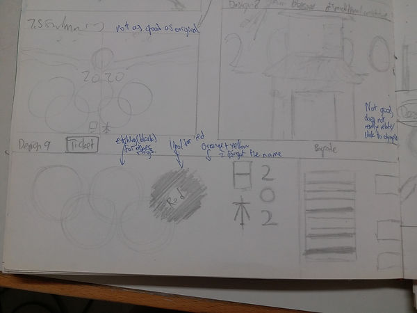
Design8(9):
This is my ticket design. Since the specific result was not specified, i though i should make a sketch of a ticket as well
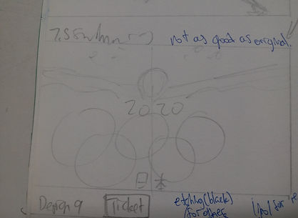
Design 9(5):
a Discus pose, i didnt finish it though since it didnt look too nice. I hoped to use foreshortening.
Design 10:
I got this nice(ish) looking pose while doodling. I decided to use it as a design for fencing (although it probably isnt a good pose for that)
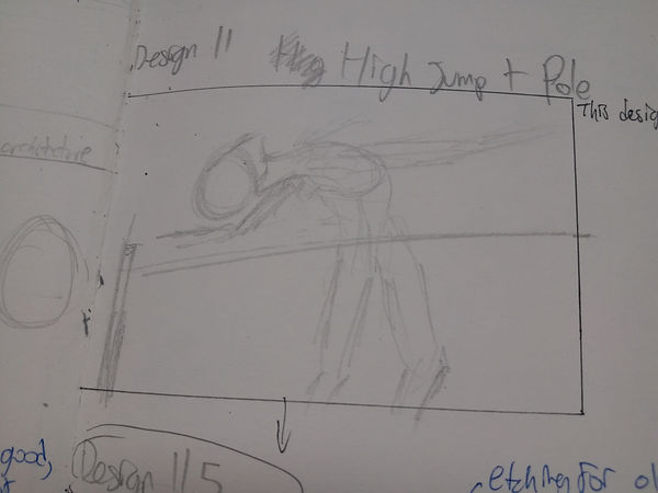
Design 11:
High/pole jump, pose too stiff though, fixed slightly in 11.5
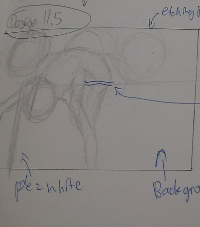
Design 11/.5:
I planned to etch the olympic rings, the rest in lino or monoprint.
Orange background
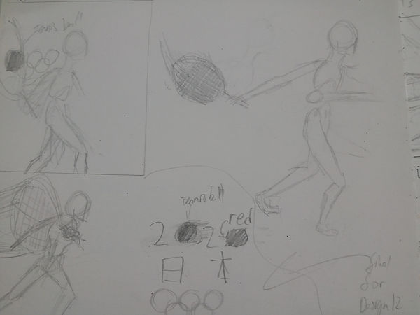
Design 12:
This is a design for tennis. I wanted to experiment with the poses a bit, and so drew it a few times.
The ball is supposed to be one of the zeroes in 2020 whilst the other is a red circle. This goes against a white rectangle to make the japan flag.
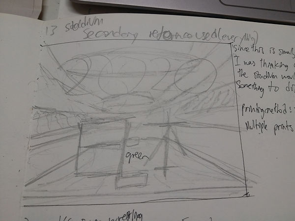
Design 13: I copied a stadium from a photo i found on the internet. I thought i needed more location based designs rather than just being sketches based on figures.
I planned to have different prints for the different colors (ceiling, seats, main field area, etc)
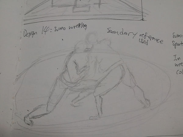
Design 14:
I found an image of sumo wrestling that i really liked so i copied it as a design.
Sumo wrestling is also a sport from japan, so it connects the themes of japan and sports a bit better than the others.
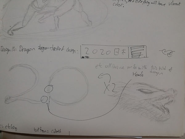
Design 15:
Rather than an actual design, this is a component i could include in my other designs. Rather than a normal text "2020", I tried to make a design that could make the 2020 out of a dragon, making it more interesting and linking to japanese themes.
Design 16:
Long jump. I started out with a pose in mind (first one), but it was too plain and unintresting so i moved onto the second idea.
The second idea (16.5) showed the jump from an angle, which allowed for a more interesting view on the pose.


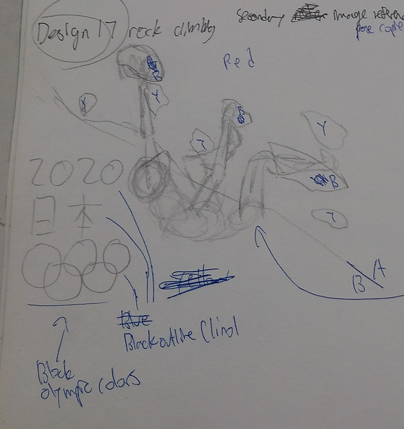
Design 17: Rock climbing
The pose was copied from the internet. The rock wall position and her pose angle was changed slightly though (hanging off rather than climbing up a 90degree wall.
This pose is pretty good for printmaking (at my level) because the pose has very little overlap compared to ther climbing poses.
The wall is to the right and the negative space is to the left.
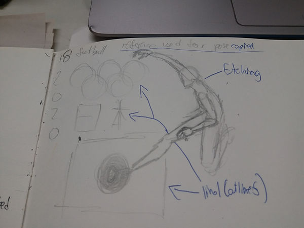
Design 18:
Once again copied pose. At this point i was moreso chucking out subjects and poses that i might want to do later.
the ball is red against the white of the rectangle
the 日本 is a lino cutout, and the olympic rings are individual rings that are cut from lino
Design 19:
The idea was for a Katsushika Hokusai "Great Wave" inspired surfing piece. basically many elements were to be derived from his work and the surfboard and person would replace the rowboats in the original (it would have been an incredibly simplified version though)

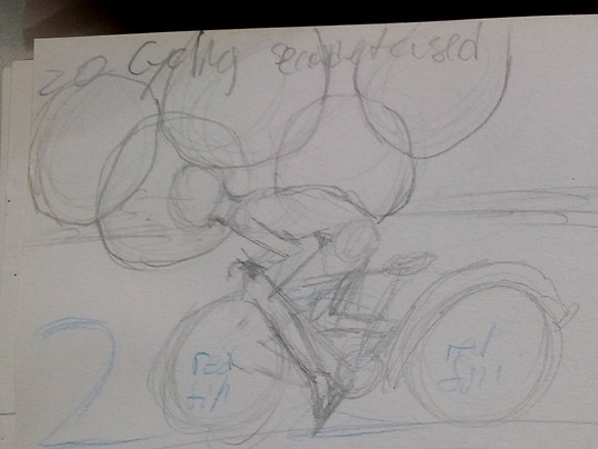
Design 20: Cycling
I really liked the circular theme to this one (nnot really but loads of circles everywhere)
I actually quite like this one since it feels like the figure is actually cycling.
The original plan was for this to do the olympic logo and 2020 in etching, and lino for the rest. However, (future me speaking) I think the piece would look better with a complete block look (lino+monoprint). Blocks as in blocks of color instead of lines.
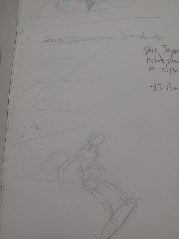
Design 21: Snowboarding
Since Japan gets a large amount of snowfall each year (one of the highest worldwide), i wanted to have one design that kind of references that, thus why i decided to do snowboarding.
(i could have done skiing but later i do something related so this was a better idea (also snowboarding pose is easier)
This is a portrait design
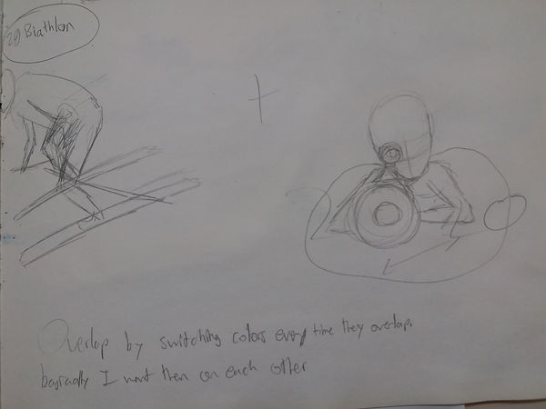
Design 22: Biathlon
Biathlonn is a sport testing both skiiing skill annd rifle aiming skill. It looked quite interesting so i chose it.
NOTE: the pose on the left was cut off by the page so thats how it looks in the book

Design 23: Ping pong
basically, i tried to do ping pong. I tried to design something similar to the tennis one, but with a better/more interesting angle.
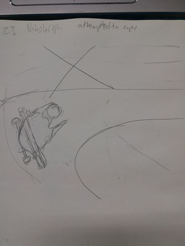
Design 24: Bobsleigh
I thought it looked pretty good, so i tried to draw a design for this. However, the cart didnt look good no matter how many times i drew it so i gave up before completing the design
Overall, I though the idea generation process was really fun since we could just sketch out ideas