Gian Galang
Artist Reaserch

Gian Galang is a contemporary artist/illustrator working in New York in the United States of America. He studied illustration + graphic design at the the VCU(Virginia Commonwealth University. He has created numerous works, some of which for famous and powerful clients such as Nike, ESPN, HBO, and Reebok. His work before his current status as a freelance artist(2020) includes being an art director for advertisements at Nickelodeon and other brands.
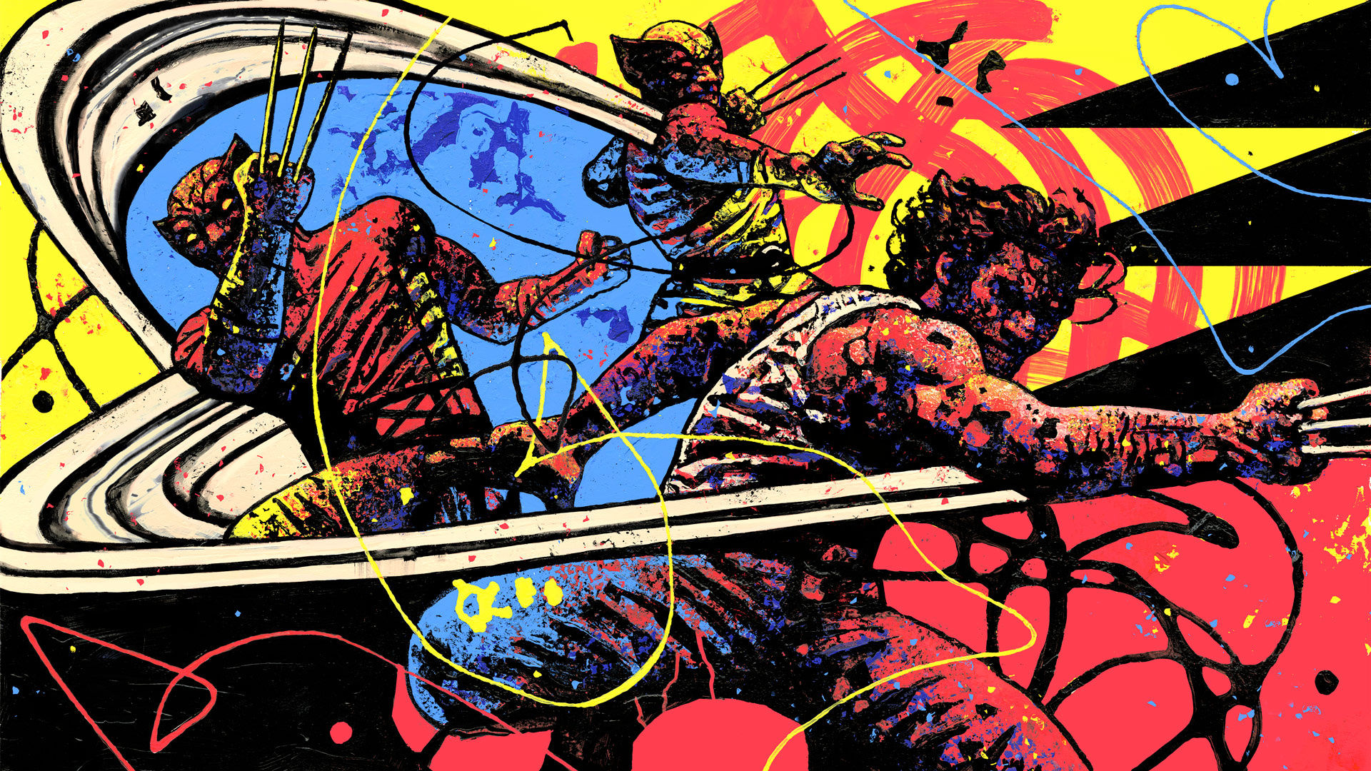
From what I could find on the internet, it seems that he does not use printmaking techniques to create his pieces. However, due to his technique it looks and feels very much like something created using monoprinting along with some elements of the other styles. I think this is because he uses mark making techniques, and a limited color scheme, thus making the result similar to something created using printmaking. In many of his pieces, it features a single base color(usually yellow or red), along with harsh shadows and highlights. Since the colors are not blended, but are highly contrasting and pure(there isn't any blending, so each color is never muddied with the other color(s) being used.
Gian Galang Works:(small selection)


CONTENT
Gian Galang’s work focuses around martial arts and fighting poses, and in nearly all cases depicts people in motion(suggested movement). It is done in a 2d format using mark making techniques. The subjects would be people in martial arts or fighting poses. The work is represented in a realistic manner(the person), but there lines and drops of paint that are added in, these lines emphasize the movement of the model.
MOOD
I imagine while creating these works Gian Galang is quite pumped/passionate about it, as the art is vibrant and powerful. The work is quite noisy with lines and drops of ink/paint, and is able to convey the weight behind the movement. The lines running through the piece convey a feeling speed. The works make me feel inspired.
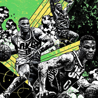
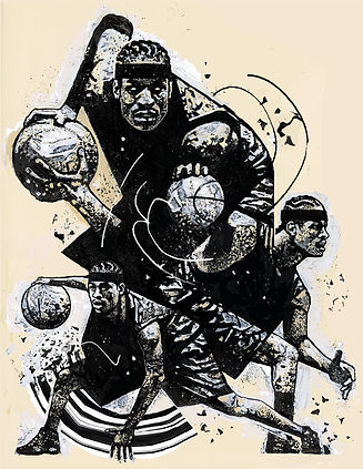
BOSTON VINYL PIECES

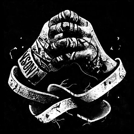
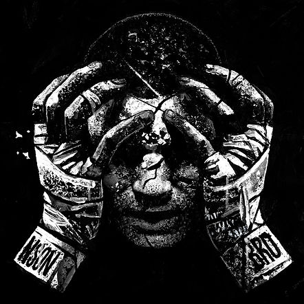

Image Breadown
This piece of art is something Gian Galang created for a Bronson Vinyl series. It depicts a single model in the middle of a punch, each depiction of the model shows the progression of the movement(wind up/the fist is low, and then the the fist is slightly higher with the body twisting, and then the final one shows the model when throwing the punch). This piece of art is a two dimensional piece(as is most, if not all of Gian Galang’s work). While the model/person is depicted realistically,, there are many touches of style around the image, the most obvious being the trail from the fist in the third movement, and the lines of paint going around the piece.
FORM
The piece looks like a cool illustration, but without the lines and trails of ink, the piece appears to be three black and white images of the model from different angles and in different positions put together. It looks this way because of his skill and ability to create realism in his work. The color scheme used is a Monochrome(black and white in this one), and like most of his other work, this piece is very noisy, with something going on in nearly every part of the image.
MY THOUGHTS
I really like the way the piece uses a mix of realism and stylised elements to create a stunning effect. The way the person is given value/depth is very interesting, as the use of only two colors (pure black and white) make the piece pop out and give it an interesting layer of depth. I think i should learn from the way lines are used to make the piece more interesting, like adding trails onto the fist and adding lines going throughout the piece. I think the lines resemble the type abstract art that has paint dripping down onto the page.
Transcript