Soft Linoleum Experimentation and Skills Development
I looked at this one differently to the other lino project and decided to try and make something i thought was cool. Did not print too many though, mainly palnning.
Design Brainstrom
Design 1:
I hoped to make a more "pattern" type design that would be more geometric and repeat if printed multiple times.

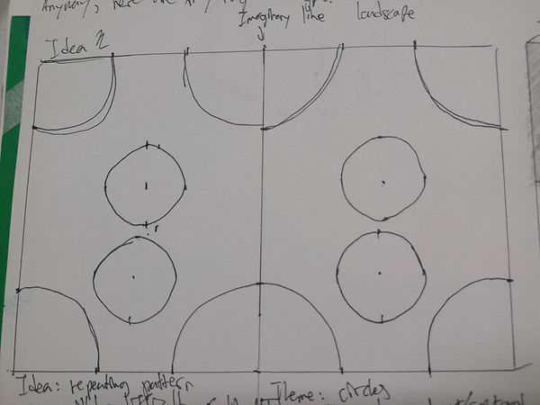
Design 2:
I wanted to make a piece that used the negative space to create the illusion of depth and perspective
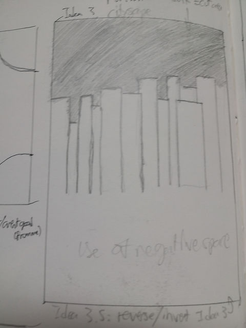
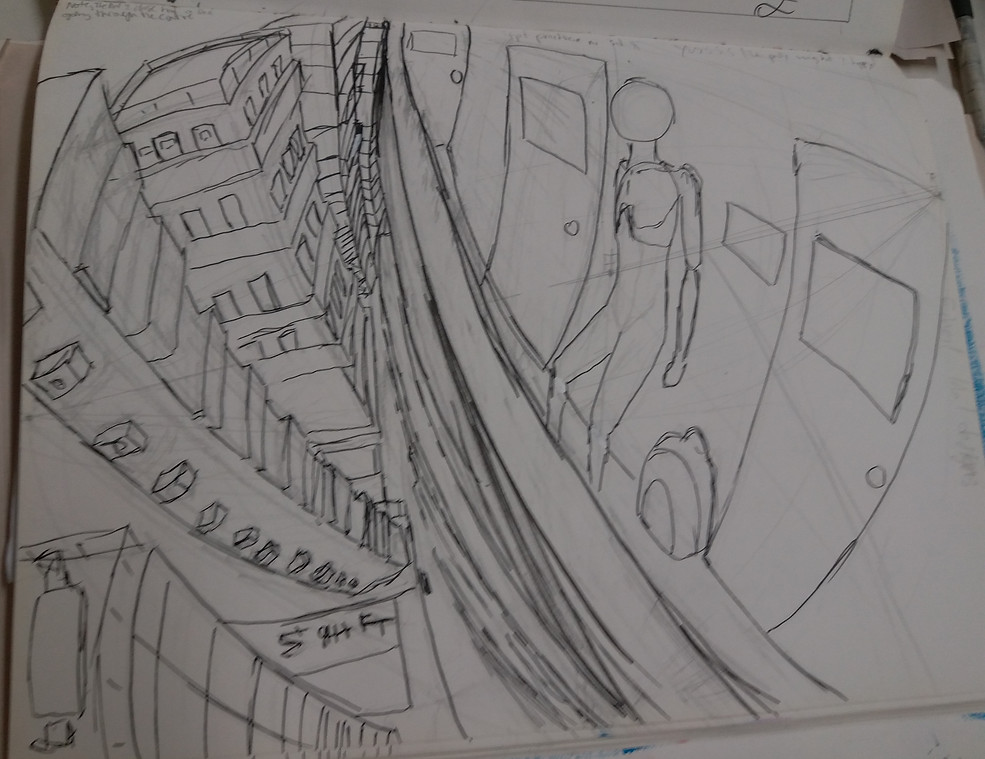
Design 3:
I hoped to make something like a cityscape where the lines seperating the structures blended into either the sky or the land (because lino has 2 colors only: surface and ink)
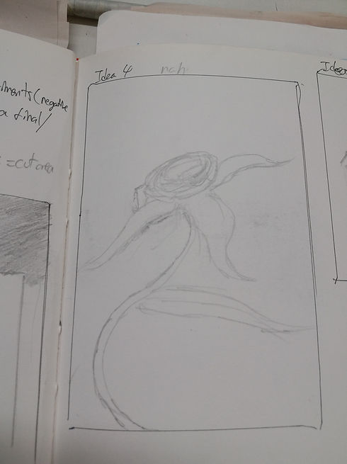
Design 4:
In textiles, i had to make a design featuring a large number of flowers, vines and leaves in a specific style. This was done based on those. I hoped to try and use varying line widths to make it look neater (not that i would have been able to haha)
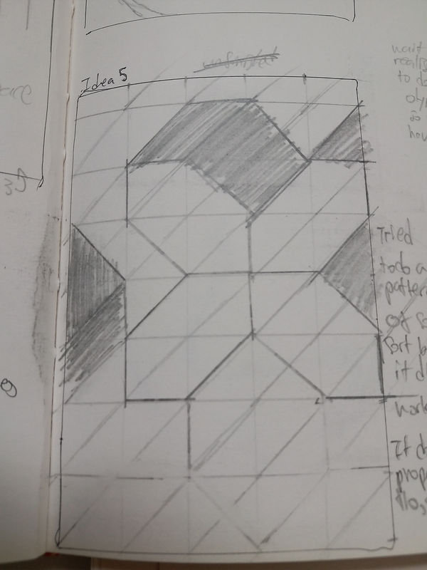
Design 5:
A simple design not using any perspective rules. I wanted to make it repeat. I also wanted the shadow and the lines to merge like how i wanted design 2 to be (shadows and lines are same)
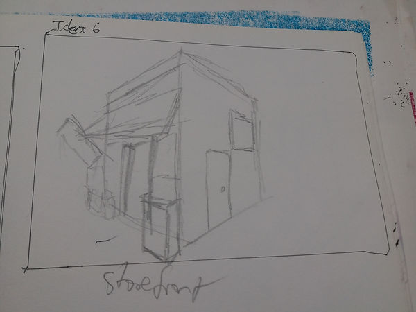
Design 6:
This is a storefront, heavily inspired by Mateusz Urbanowicz. His work also inspired my final design for this Overall Unit. (i tried to incorporate elements i remembered from his storefront works)
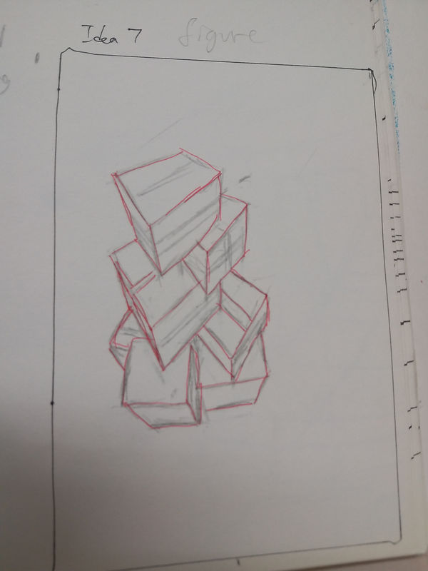
Design 7:
Some boxes stacked. I quite like how it looks.
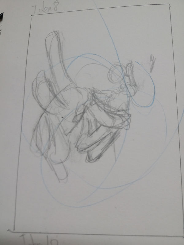
Design 8:
I wanted to have a person as a potential design so i put in one.
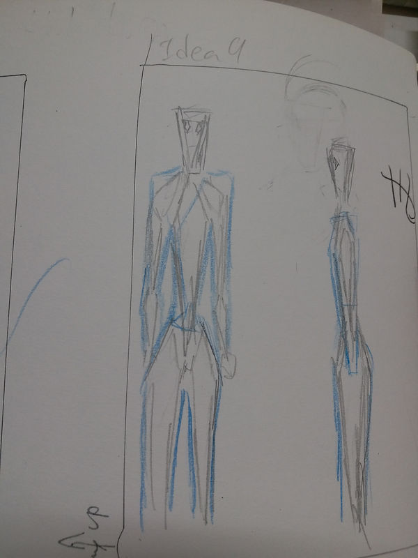
Design 9:
Attempt to draw the body of a triangle themed cartoon figure. doesent look to good though aha
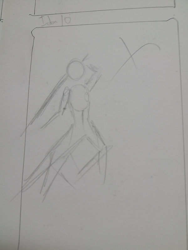
Design 10:
Another figure, i dont know what to say... it gets better after this design.
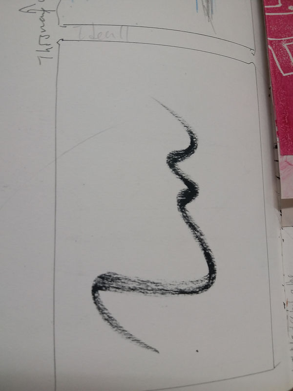
Design 11:
i wanted to make a print on a dry brush stroke. (i have no idea what i was thinking)
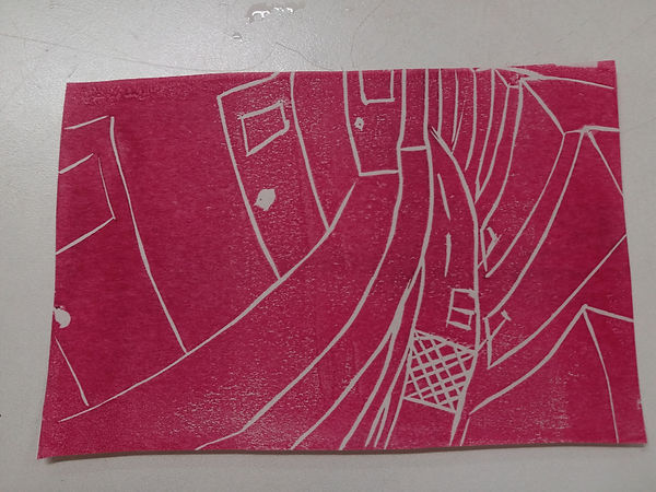
FINAL DESIGN FOR SOFT LINO
Design 12:
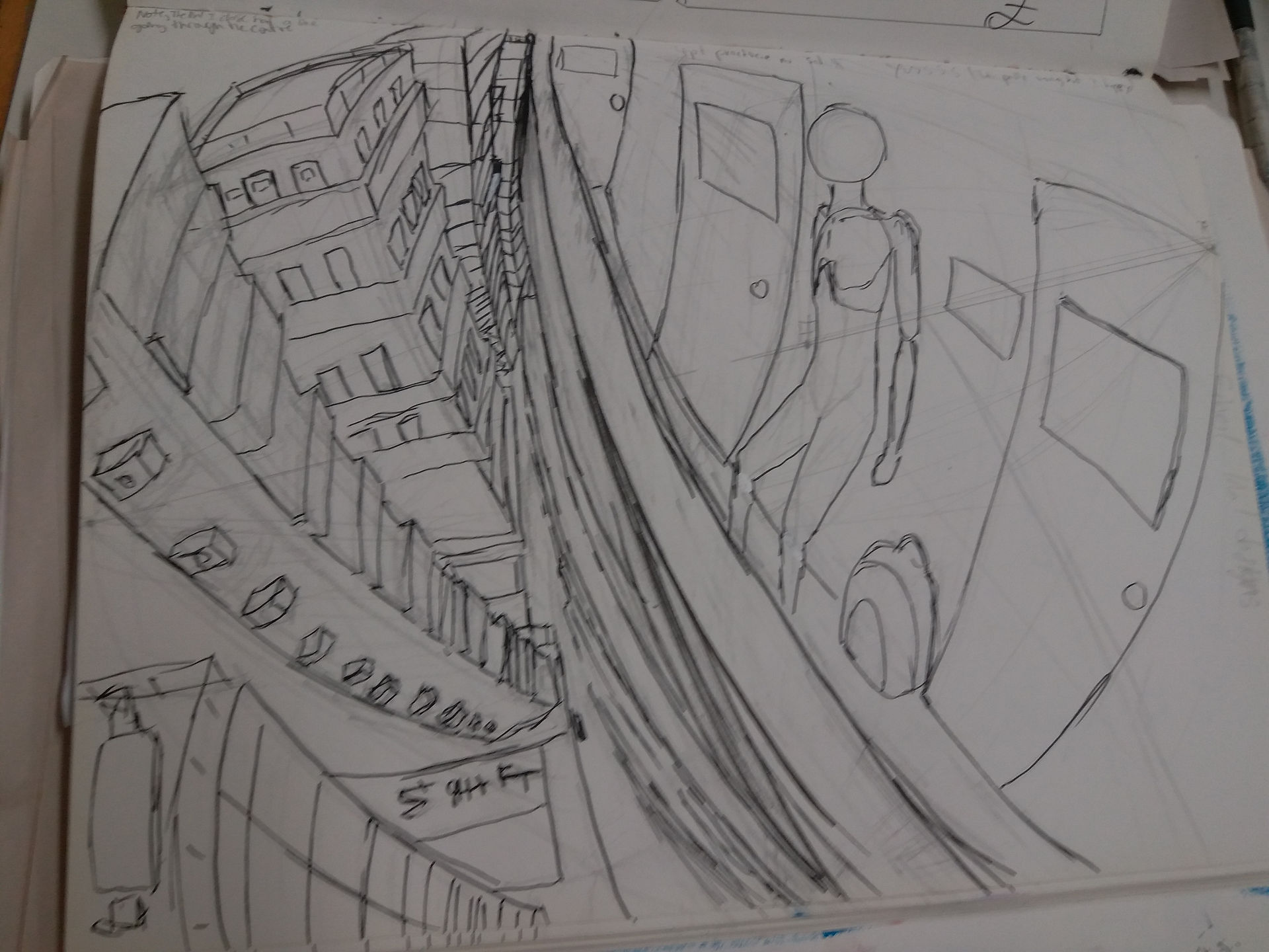
I found an image showing a really intuitive way to think about warped perspective. I tried using their technique here. I think it looks okay, but this is just because i dont know anything about warped perspective, so it's probably all wrong aha.
That being said though this is my best perspective piece i think. (without using 3D aid)
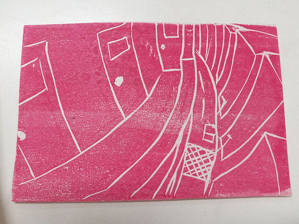
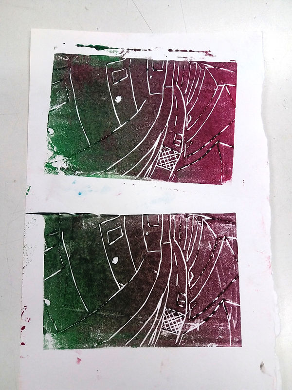
Prints
Since the deadline for the real final was quite close, i didnt get too much time to cut or print. i just made a copy real quick and printed it a few times.
Inconsistent pressure (bottom middle not done well)
Inconsistent pressure again. some areas have more or less grain.
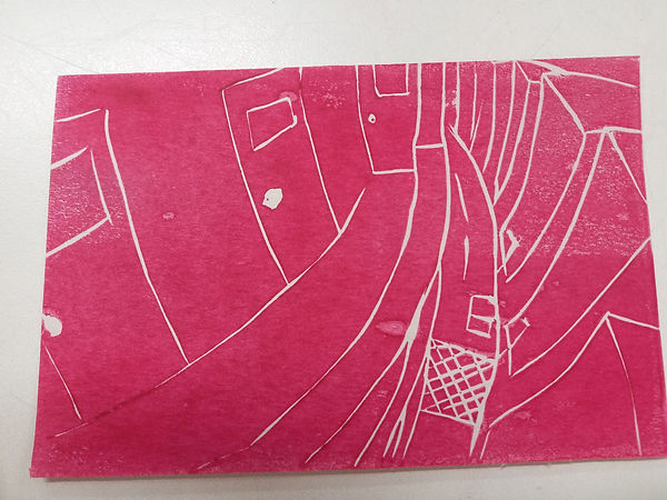
some areas over inked, and some areas not enout pressure (left mid/top and right top and bottom)

Theres loads of grain/not a perfect block. However, it is more consistent than the rest.
Attemot at using gradients
Over inked
Not enough pressure on bottom print
bottom left corner messed up on both

Both over inked, but top one is better,
left bottom corner is once again not done well